Visual Hierarchy and Balance in Design
Learn how to guide user attention and create harmonious compositions through effective visual hierarchy and balance principles.
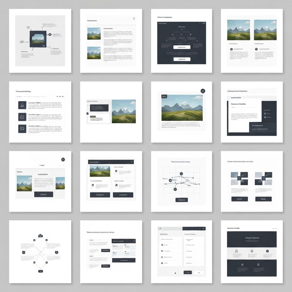
Understanding Visual Hierarchy
Visual hierarchy is the principle of arranging elements to show their order of importance. It guides viewers through your design in a specific order, ensuring they see the most important information first.
Key Principles of Visual Hierarchy
- Size and Scale: Larger elements naturally draw more attention than smaller ones
- Color and Contrast: High contrast elements stand out and capture attention first
- Typography: Font size, weight, and style create clear information hierarchy
- Spacing: White space around elements increases their perceived importance
- Position: Elements at the top or center typically receive more attention
- Repetition: Consistent styling helps users understand relationships between elements
Types of Balance
Symmetrical Balance
Elements are evenly distributed on both sides of a central axis, creating formal, stable, and traditional compositions. Common in corporate and professional designs.
Asymmetrical Balance
Elements of different visual weights are arranged to create equilibrium without mirroring. This creates more dynamic, modern, and interesting compositions.
Radial Balance
Elements radiate from a central point, creating circular or spiral patterns. Effective for drawing attention to a focal point.
Mosaic Balance
Elements are arranged without a clear focal point, creating organized chaos. Each element has equal visual weight, common in pattern designs.
Implementing Visual Hierarchy
Typography Hierarchy
- Use 3-4 distinct text sizes maximum
- Establish clear heading levels (H1, H2, H3)
- Vary font weights to create emphasis
- Use color strategically to highlight important text
- Maintain consistent line heights and spacing
Layout Hierarchy
- Place primary content above the fold
- Use the F-pattern or Z-pattern for content flow
- Group related elements together
- Create clear visual paths through your design
- Use containers and cards to organize information
Practical Applications
Web Design
In web design, visual hierarchy ensures users can quickly scan and understand content. Use larger headings, strategic color, and clear spacing to guide users through your interface.
Print Design
Print materials benefit from strong hierarchy to communicate messages quickly. Use size, position, and contrast to create clear reading order.
Mobile Design
Limited screen space makes hierarchy even more critical. Prioritize essential information and use progressive disclosure to reveal details.
Common Mistakes to Avoid
- Making everything large and bold (nothing stands out)
- Using too many font sizes or colors
- Ignoring white space and cramming elements together
- Inconsistent styling across similar elements
- Poor contrast making text hard to read
Conclusion
Mastering visual hierarchy and balance is essential for creating effective designs that communicate clearly and guide user attention. Practice these principles consistently, and your designs will become more professional and user-friendly.